Mapping.....
....representing 3D elevation terrain data in a human-friendly form. Here is Google Maps presentation of an area used recently for an O-course. I've asked it to use 3x vertical exaggeration. It amounts to an aerial photograph.
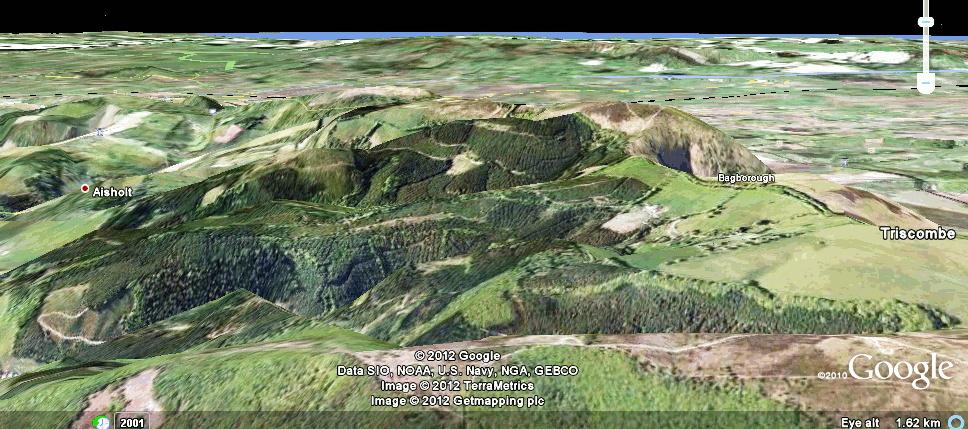
....representing 3D elevation terrain data in a human-friendly form. Here is Google Maps presentation of an area used recently for an O-course. I've asked it to use 3x vertical exaggeration. It amounts to an aerial photograph.
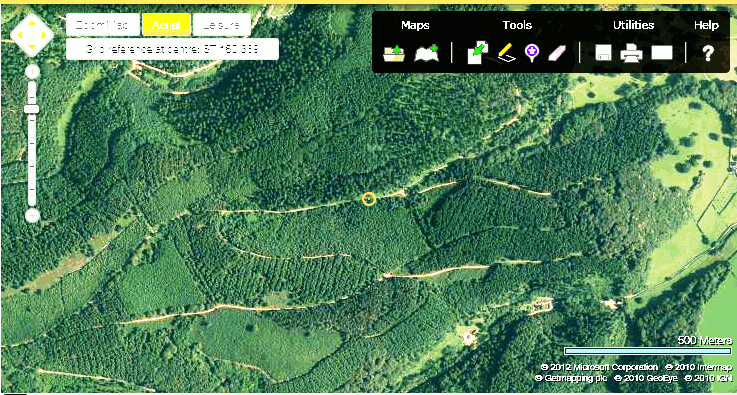
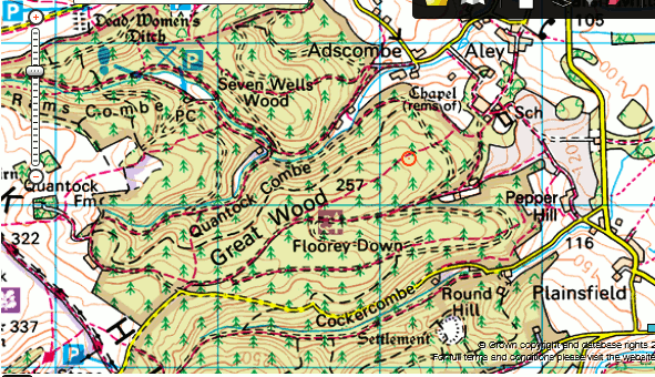
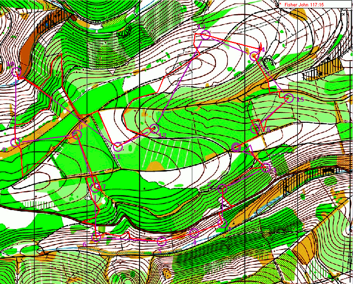
Even our O-maps can't make everything crystal-clear. That's one of my excuses for slow performances! I find it particularly hard to tell whether contours are representing rising or falling ground- the streams are not clear enough to show which are ridges & which are valleys. Hilltops & cliffs are the most helpful features here, but are not always present.
We have become used to colour, laser-printed high quality maps. And on the web, with RouteGadget, can even watch our animated route as the young stallions race ahead of us.
My first orienteering involved black-and-white maps on non-waterproof paper. You hand-copied the map corrrections, course controls, etc.
This page is dedicated to Dave Holmes, orienteer & mapper extraordinaire, and a great friend who we all miss. In our hearts you are running forever, Dave.