 -
- 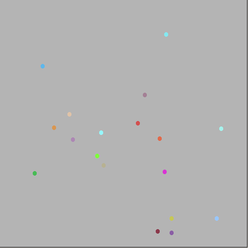
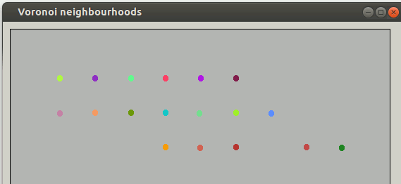
Here are two sets of displayed data points, read from a CSV file with a header row and then rows layed out as 'ref. no,. x, y'. The number of rows is found by seeing how many CRLFs ( or in Linux, LFs) there are. The left hand set are nearly on a regular grid- the right hand set are at random places. The mapping allows you to easily detect visually the nearest-neighbour of any given location- useful originally in things like the epedemiology of infection from water sources. The 'Broad Street Pump'. See Wikipedia for more information.
-
The idea is to display areas-of-influence. We assume that the nearest-neighbour is totally dominant, ie a sharp swap-over at the equidistance borders.... The Voronoi idea is to find the lines of equidistance and show them- here I do this in colour. This is a straight Pythagoras calculation. More fiddly is finding max and min so the range fits totally on-screen. Black dots are left to show the centre concerned for each region.
Programming this was a classic example of why I love LB. I hadn't heard of Voronoi until I saw the Rosetta Code task. It was fun to code- I love visual-output from my code! In the recent version I started getting carried away with considering how far we can/should extrapolate outside the data field, and possibilities of distance-weighting. Auto-scaling. Add generation of a random or perturbed-grod of data. Superpose on a real-life map ot towns.... Still mileage in those directions. It's been a welcome distraction from my back problems. (I'm probably neeeding surgery, and can sit & drive but not stand straight or walk more than very short distances.)
 -
- 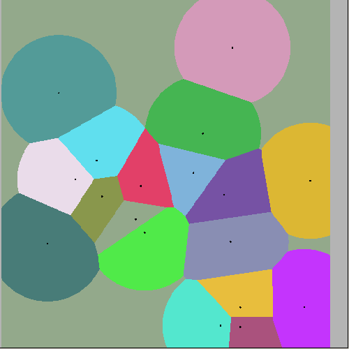
Of course as you move further from data points it should really become less dominant- the following gives a bit of an impression of this.